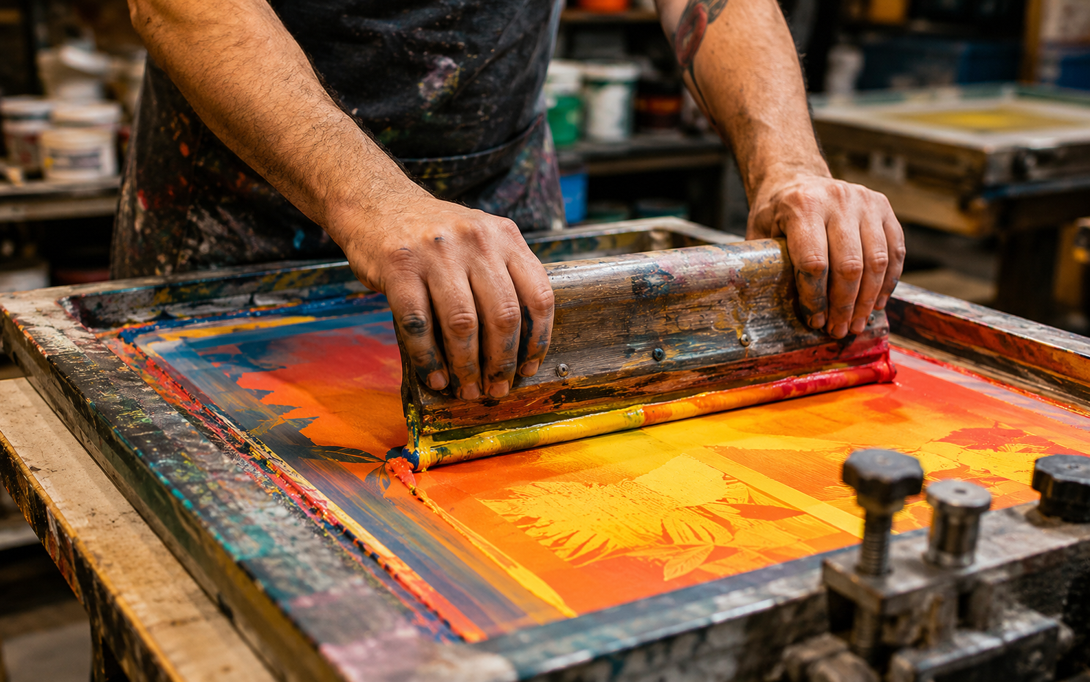
If you have spent any time at an independent bookshop, art fair, or design school open house in the past few years, you have almost certainly encountered risograph prints — even if you did not know what you were looking at. They have a distinctive quality: slightly grainy, vividly colored, with that charming imprecision that comes from soy-based inks layered one drum at a time through a stencil-based process.
The Risograph machine itself is not new. Manufactured by the Japanese company Riso Kagaku Corporation, these duplicators were designed in the 1980s for high-volume office printing — think school newsletters and church bulletins. They were never intended as creative tools. But artists, being artists, saw potential where office managers saw utility.
The Appeal of Imperfection
Part of the risograph's charm lies in what it cannot do. Unlike a laser printer, a riso machine does not produce pixel-perfect output. Registration between color layers is never quite exact. Ink density varies slightly from print to print. Solid fills show a characteristic grain. For anyone raised on the antiseptic precision of digital output, these imperfections feel like a revelation — proof that a human hand was somewhere in the process.
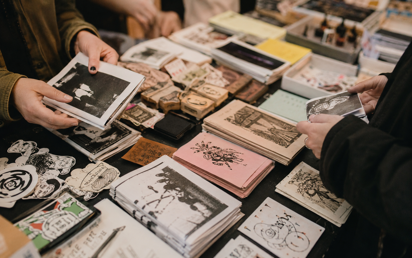
This aesthetic dovetails neatly with broader cultural trends toward the handmade, the imperfect, and the limited-edition. In a world of infinite digital copies, a risograph print run of two hundred feels precious. Each copy is technically unique, with its own tiny misregistrations and ink variations.
Economics of the Small Press
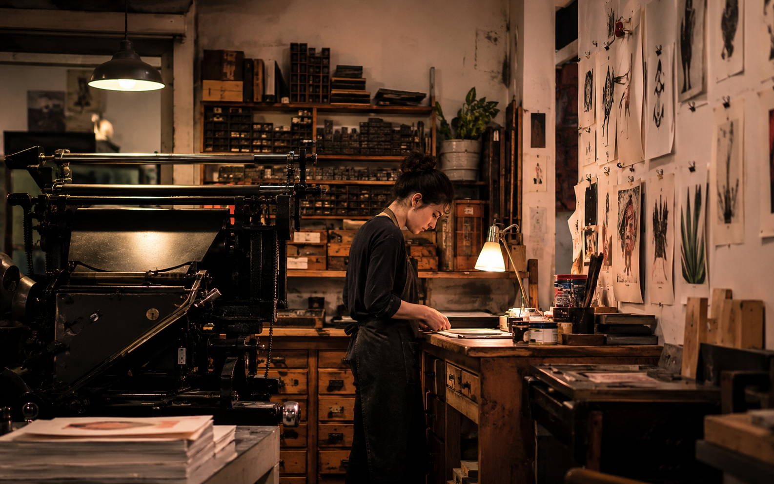
There is a practical dimension to the risograph revival as well. For small publishers and independent artists, riso printing occupies a sweet spot between photocopying and offset lithography. A used riso machine can be purchased for a few thousand dollars, and the per-unit cost of printing is remarkably low once you own one. This makes short runs of zines, art prints, and small books economically viable in a way that traditional printing simply is not.
The result has been an explosion of small riso studios around the world. From Brooklyn to Berlin, Melbourne to Mexico City, these operations often function as both print shops and creative communities, offering artists affordable access to the machines and a network of like-minded makers.
Color as Language
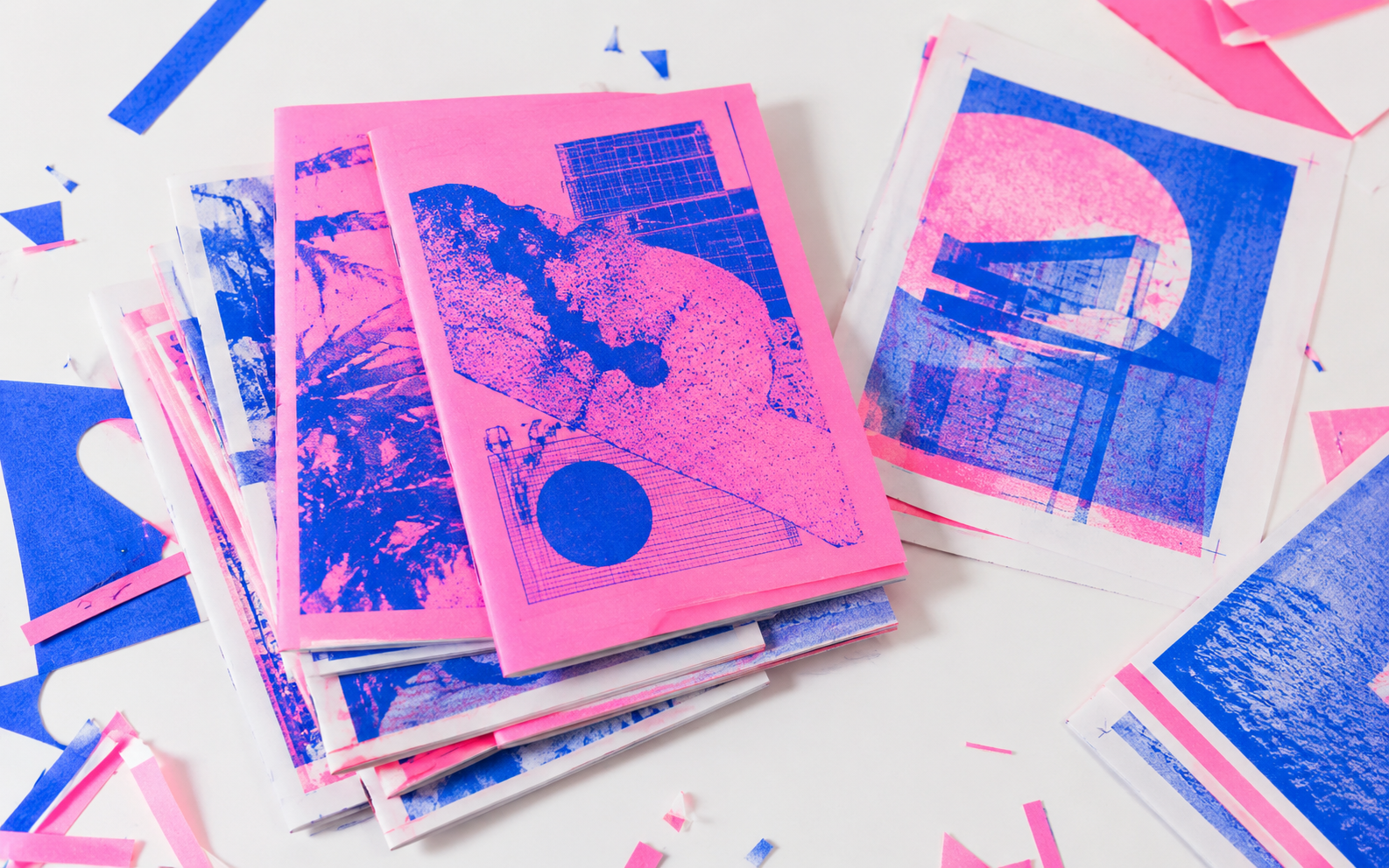
Risograph's color system is one of its most distinctive features. Rather than using CMYK process color, riso machines print with spot colors — each ink loaded into a separate drum. The available palette reads like a paint store fantasy: fluorescent pink, teal, cornflower, sunflower, metallic gold. Artists learn to think in layers, planning how overlapping transparent inks will mix on the page to create new hues.
This constraint breeds creativity. Designing for riso means accepting limitations and working within them, much like early video game artists working with restricted color palettes. The best riso work embraces these constraints rather than fighting them, producing images that could not have been made any other way.
Not Nostalgia, but Necessity
It would be easy to dismiss the risograph trend as retro nostalgia — artists playing with vintage machines the way musicians collect analog synthesizers. But that reading misses the point. For many practitioners, riso is not a nostalgic choice but a practical and aesthetic one. It allows them to produce physical work at a reasonable cost, with a visual character that feels genuinely distinct from anything a digital printer can produce. As long as artists value those qualities, the risograph will keep humming along.